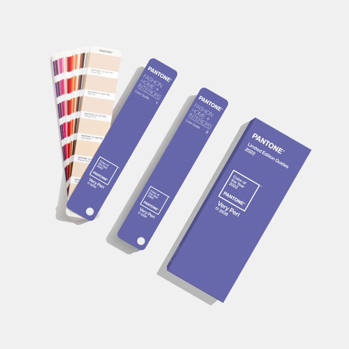
潘通日前发布了2022年的代表色彩,这是一种用宁静蓝和活力红调制而成的新颜色,潘通将其称为“仙女紫”。这是潘通首次选用新颜色作为年度色彩,旨在传递强烈的新感觉。

文章插图
The periwinkle shade is a brand new edition to Pantone"s color libray. Credit: Courtesy of Pantone Color Institute
While many of us will spend the final days of 2021 reflecting on its whirlwind events, global color authority Pantone has already been busy looking ahead -- to decide on the shade that will best encapsulate 2022.
2021年到了尾声,许多人都在回顾过去一年接踵而至的纷繁事件,全球色彩权威机构潘通却早已开始展望未来,决定出最能代表2022年的颜色。
On Wednesday it unveiled Very Peri, a periwinkle hue that the company says combines the steady tranquility of blue with an energetic infusion of red. It"s the first time the company has manufactured a color instead of delving into their pre-existing archive.
12月8日,潘通发布了2022年度色彩,仙女紫。据称这种长春花紫色是将宁静蓝和活力红混合而成。这是潘通首次选用自己调制的新颜色,而非像以往那样选用色库里已有的颜色。
"It was really important for us to come up with a new color, because we have a very new vision of the world now," said Pantone Color Institute"s Executive Director Leatrice Eiseman in a video call.
潘通色彩研究所的执行总监丽特里斯·艾斯曼在视频会议中讲道:“选用新颜色作为年度色彩对我们来说真的很重要,因为我们现在对世界的看法已经焕然一新。”
"It is literally the happiest and the warmest of all the blue hues," she added, describing the shade. "Because of that red undertone, it introduces an empowering feeling of newness, and newness is what we"re looking for."
她在描述这一颜色时说道:“这是所有蓝色调中最快乐也最温暖的颜色。加入的红色给人带来一种强烈的新感觉,而这种新感觉正是我们要寻找的。”
The pandemic has heavily impacted how we normally live and work -- posing obstacles that have forced people to think outside the box.
疫情深深影响了人们正常的生活和工作方式,也带来了重重阻碍,这迫使人们跳出固有思维模式。
"We"ve gone through so many challenges over this time, we don"t know what"s going to pop up from one day to the next," said Pantone"s vice president Laurie Pressman, who was also on the call. "It"s curiosity that"s helping people to get through these difficult times. What we would call courageous creativity."
潘通色彩研究所副所长劳里·普雷斯曼在视频会议中说:“这段时间我们经历了这么多挑战,我们不知道明天还会发生什么事。正是好奇心帮助人们度过了这些艰难时刻,或者可以称之为勇敢的创造力。”
"The color symbolizes the future," Eiseman adds. "(It) has that sprightly, joyous attitude that we"re talking about, that carefree confidence, and creative spirit."
艾斯曼补充道:“这一颜色象征着未来。它包含着我们谈论的那种活泼欢乐的态度,那种无忧无虑的自信,还有创新精神。”

文章插图
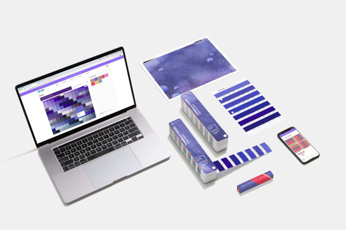
The color authority have partnered with Microsoft and will be rolling out the color accross various applications. Credit: Courtesy of Pantone Color Institute
Each year, Pantone attempts to interpret the zeitgeist through the lens of color theory -- mining the likes of fashion, design and interiors for clues.
每一年,潘通都试图通过颜色理论来解读时代精神,从时尚、设计和室内装修等各个领域去找寻线索。
And it"s no stranger to making unconventional picks: In 2016, the company chose a gradient made out of two shades, Rose Quartz and Serenity, to reflect a year defined by shifting gender politics. In 2020, not one but two colors -- Ultimate Gray and Illuminating (a vibrant yellow) -- were selected to capture both the resilience and optimism shown during the first year of the pandemic.
在挑选年度色彩方面,潘通惯于打破常规。2016年,潘通选择了水晶粉和宁静蓝两种色彩的渐变组合来反映性别政治变迁的一年。2020年,潘通选择了两种颜色——极致灰和荧光黄——来表达人们在疫情第一年所展现出的坚韧和乐观。
The annual task of forecasting the color that will best reflect the year ahead has been a more than 20-year endeavor, beginning as a desire to cultivate conversations around the power of color, says Eiseman.
潘通每年都要选出最能代表下一个年度的色彩,艾斯曼指出,这项已经持续了20多年的任务最初是为了引发人们关于色彩力量的对话。
推荐阅读
- 超模|爱了!阿曼达·霍尔顿女儿莱西16岁就显示出超模的潜力!
- 陈妍希|38岁陈妍希穿紧身裙躺地!曲线曼妙皮肤白嫩,被老公枕大腿好甜蜜
- 蔡少芬|蔡少芬不愧是“港姐”出身,48岁穿旗袍优雅又曼妙,娘娘又惊艳了
- 陈乔恩|陈乔恩自曝体重曾达126斤,6个月减重22斤,开工照身姿曼妙如少女
- 杨幂|杨幂变身民国美人,穿着一袭明艳动人的旗袍,袅袅婷婷曼妙而来。
- 曾沛慈|张曼玉:多少片酬都不再和章子怡合作,晚年暴瘦穿地摊货依然潇洒
- 叶罗丽|叶罗丽从第一到第九季的变化,直接换头的角色,不止曼多拉一个
- 费曼|吴镇宇儿子费曼在社交平台发文,因语病问题,和网友“怼”起来了
- 莱昂纳多·迪卡普里奥|损友揭露小李子的喜好,拍摄《不要抬头》期间拉着看《曼达洛人》
- 张智霖|与宣萱绝交十年,暗骂佘诗曼狐狸精,为何张智霖仍不离不弃?


![[坦言]收入提高了?滴滴司机坦言:因为平台这波操作,现在收入](/renwen/images/defaultpic.gif)


